Installing the App in Your Shopify Theme
Add Send To Many's multi-recipient checkout to your Shopify theme with no code. Place the checkout app block, set its layout, colors, and add-ons, and assign a configuration.
Multi-recipient checkout installs as Shopify theme app blocks, so getting it onto your storefront takes a few minutes with no code required in most cases. This article covers adding the checkout block to a page and configuring its settings: layout, colors, product add-ons, custom scripts, and which checkout configuration the page uses.
Once the block is on a page, you decide how shoppers get to it. That's covered separately in How shoppers find checkout.
If you'd rather follow a full start-to-finish walkthrough that also covers settings and testing, see the step-by-step setup guide.
The Two App Blocks
Send To Many adds two theme app blocks you can place in the theme editor:
- Multi Recipient Cart v2: The checkout experience itself. You add this block to a page template, then create a page that uses that template. This is the page where shoppers enter recipients, pick products, and pay.
- Multi Checkout Button: A button that links shoppers to your multi-recipient checkout page. You add this block to your cart template when you want to keep your standard cart and send shoppers to checkout from a button. See How shoppers find checkout for where this fits.
This article focuses on the Multi Recipient Cart v2 block. You always need it.
Add the Checkout Block to a Page
- Open the theme editor. From the Send To Many checkout settings page, click the external link icon next to Placement to jump straight there. You can also go to Online Store → Themes → Customize in your Shopify admin.
- Use the page template dropdown at the top to create a new template (name it something like
multi-recipient-checkout). - Click Add section or Add block and select Multi Recipient Cart v2 from the app blocks. The block appears with its default settings.
- Save the template.
Then create the page that uses this template:
- Go to Online Store → Pages and click Add page.
- Set a title (e.g., "Send to Multiple Recipients").
- In the Theme template dropdown, select the template you just created.
- Save the page and note its URL (e.g.,
/pages/multi-recipient-checkout).
The block includes auto-format and auto-position options that match your theme's existing checkout button styling and placement, so it integrates cleanly with most Shopify themes out of the box.
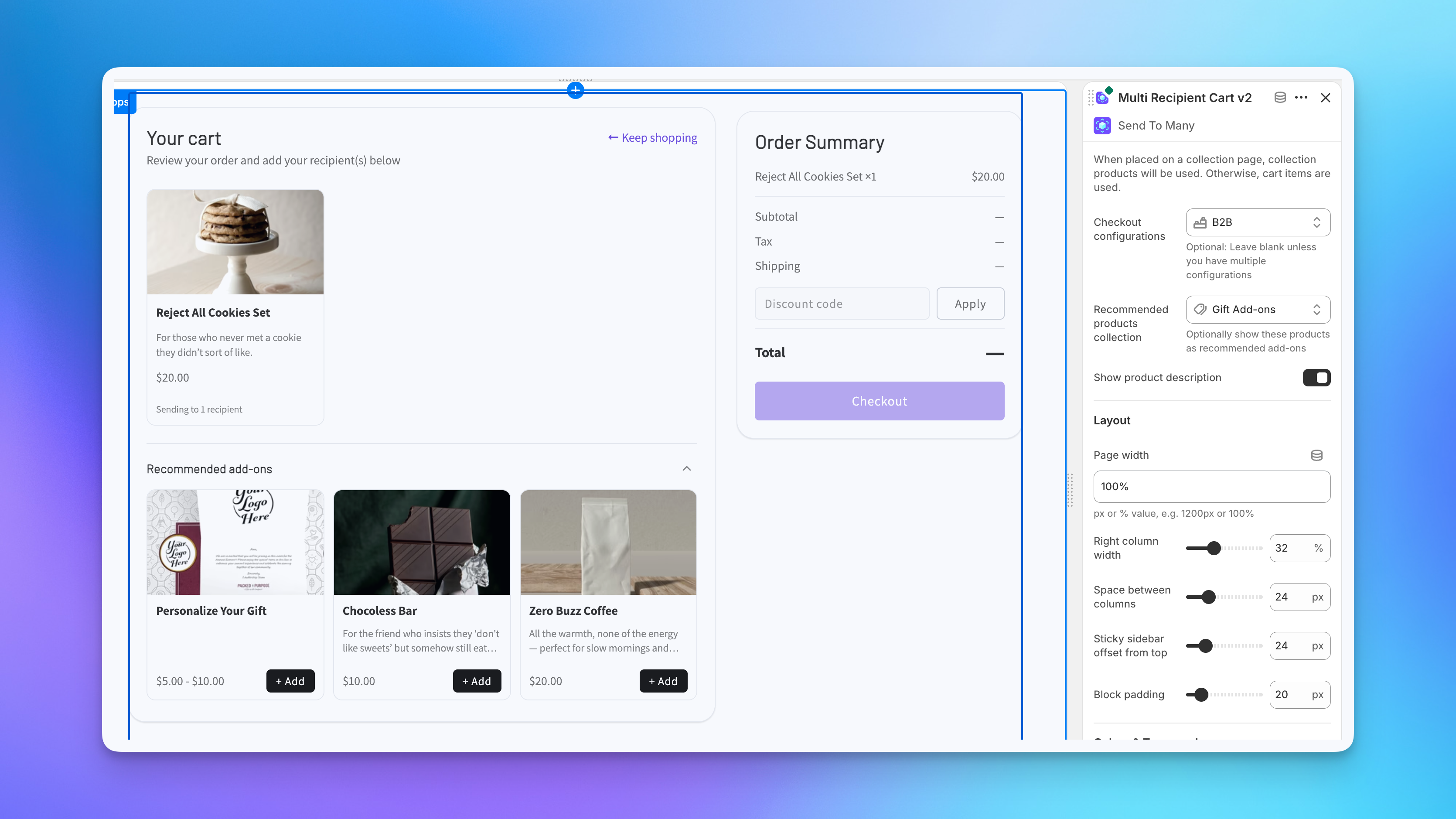
Block Settings
Select the block in the theme editor to open its settings panel. Everything here is per-block, so the same checkout can look different on different pages. The settings are grouped into the sections below.
General
- Checkout configurations: Leave this blank unless you run multiple checkout configurations. When you have more than one, use this to pick which configuration the page uses. See A note on configurations below.
- Recommended products collection: Select a collection to show its products as recommended add-ons at the top of the checkout, which is useful for gift wrap, greeting cards, or gift notes. Leave it blank to show no add-ons.
- Show product description: Display each product's description in the checkout's product picker.
When the block is placed on a collection page template instead of a standalone page, it uses the collection's products instead of the cart contents. This is handy for dedicated gifting pages where shoppers browse a curated set of products.
Layout
- Page width: The maximum width of the checkout, as a pixel or percentage value (e.g.,
1200pxor100%). - Right column width: How wide the sticky order summary column is.
- Space between columns: The gap between the recipient area and the order summary.
- Sticky sidebar offset from top: How far the order summary sits from the top of the viewport as it sticks while scrolling.
- Block padding: Padding around the whole checkout block.
Colors & Typography
- Background color: Used for cards, modals, and tertiary buttons.
- Text color: Used for headings and inputs.
- Body text color: Used for body text and labels.
- Accent color: Used for primary buttons, links, focus rings, and the selected card outline.
- Error color: Used for validation messages and error states.
- Card & input border color: The border color on cards and form inputs.
- Heading font size: Sets the heading size in pixels. Body and caption sizes are derived from this.
- Input & button font size: The font size for inputs and buttons in pixels.
Cards
- Card border radius: Corner rounding on recipient cards, in pixels.
- Card padding: Inner spacing on cards.
- Product image height: The height of product images in the picker, in pixels.
Buttons & Form Inputs
- Input border radius: Corner rounding on form inputs, in pixels.
- Button border radius: Corner rounding on buttons, in pixels.
- Secondary button background color: Background for secondary buttons.
- Secondary button text color: Text color for secondary buttons.
Custom Script
The Custom script setting (under Custom implementation) lets you inject Liquid into the checkout page for customization beyond CSS, such as tracking pixels or conditional content that depends on Shopify data. It runs on this page only. For more on advanced customization, see Advanced settings.
For full CSS styling beyond these block controls, see CSS customization.
A Note on Configurations
If you run more than one checkout setup, configurations are bound to the theme at the page-template level. Each page template you add the checkout block to can point at a specific configuration using the Checkout configurations setting in the block's settings panel. The page then runs entirely on that configuration's recipient fields, discounts, order processing, translations, and more.
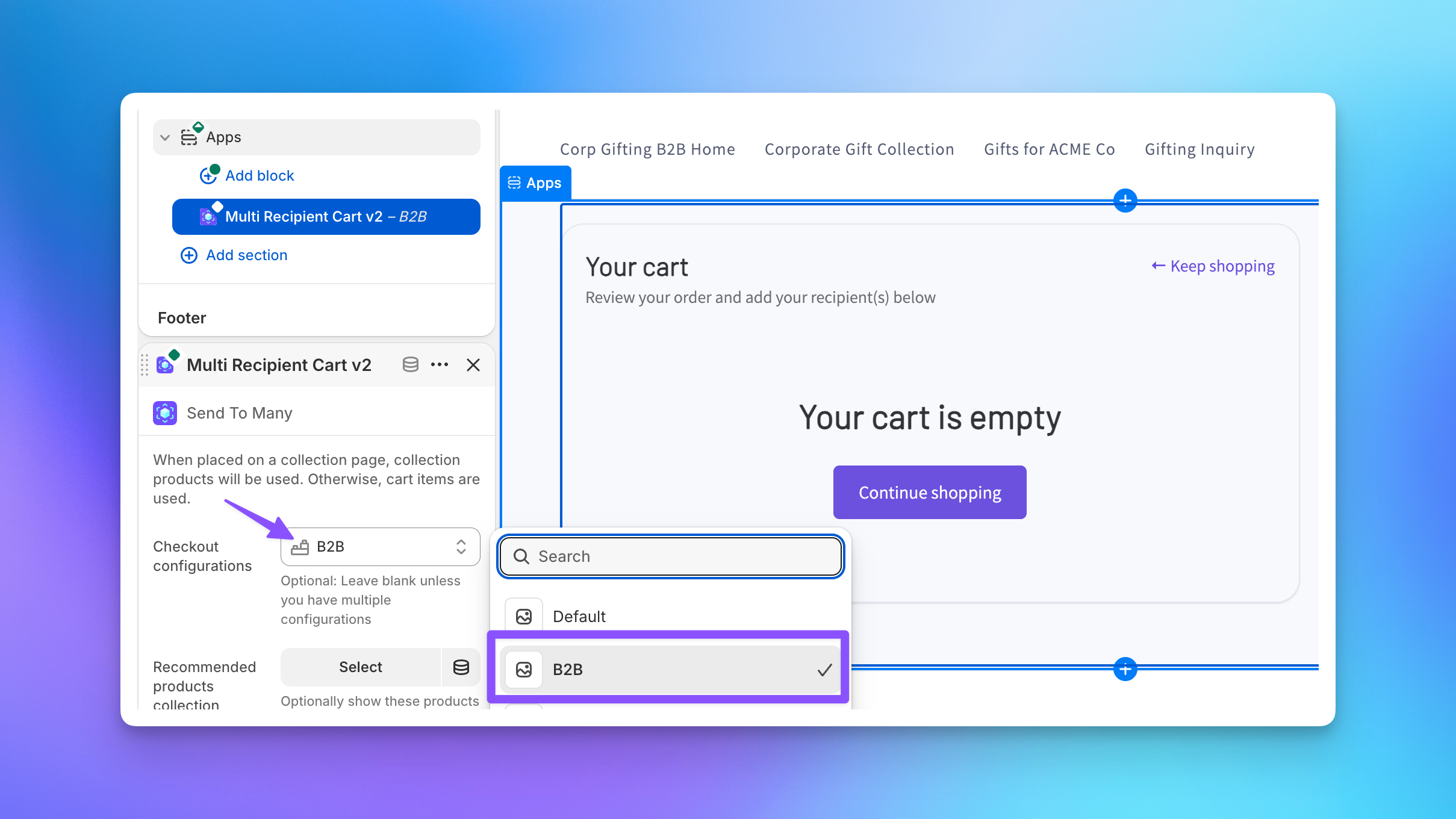
Multiple configurations require a Pro plan or higher. For setup details, see Multiple checkout configurations.
Connect Shoppers to Your Checkout
With the block on a page, the last step is getting shoppers there. You can replace your cart page, add a toggle that lets shoppers switch between single and multi-recipient checkout, add a button to your cart, or wire up a drawer or slide cart. See How shoppers find checkout for every option.
Next Steps
- How shoppers find checkout: Connect shoppers to your checkout page with a toggle, button, or cart link
- Setting up multi-recipient checkout: Full walkthrough including settings, testing, and going live
- How multi-recipient checkout works: The shopper experience from cart to order
- Multiple checkout configurations: Different checkout setups for different pages
- CSS customization: Match the checkout to your store's branding